The Apple iPad 2 has arrived, and the big question is, how does it stack up against the competition? To provide an answer, I've been testing the iPad 2 next to the Motorola Xoom and the Samsung Galaxy Tab.
Here are my thoughts about which models perform best on ten crucial criteria.
Which Tablet Is Easiest to Hold?
Hands-down, the 7-inch Galaxy Tab gets the nod here. Yes, it's chunky (0.5 inch thick, with boxy sides); but at a weight of 0.8 pound, it's significantly lighter than the iPad 2 (1.3 pounds).
That said, the 9.7-inch iPad 2 (at left) is the way to go if you want a tablet with a bigger screen. It's much easier to hold than its predecessor, thanks to its tapered sides, thinner design, and lighter weight (the original iPad tipped the scales at 1.5 pounds). The Motorola Xoom, at 1.6 pounds and with a thickness of 0.5 inch, is leaden by comparison.
Weight and thickness matter more than you might think--and not just because most people like to hold a book or magazine in one hand to read it. It's important to realize that when you use the tablet without a surface, you are essentially holding it one-handed, because you have to use your other hand to operate the tablet.
Which Tablet Has the Best Screen?
Here, the iPad 2 (at left) gets the win. Images on its display looked evenly and accurately saturated and balanced. I wish that text looked significantly sharper--I prefer precise text with no jaggies, the way it appears on an iPhone 4--but the iPad 2 still beats the competitors in its category.
The rival tablets have different shortcomings. I liked the sharpness of the Galaxy Tab's 1024-by-600-pixel display, but not the tendency of its 7-inch LCD to produce oversaturated colors (the Tab is shown on top of the Xoom in the picture below). The Tab is a pleasure to look at otherwise, and it finishes a close second to the iPad overall, but don't expect a high level of color accuracy from it.
The Xoom has a 1280-by-800-pixel display, but its text rendering was inconsistent, with several fonts showing unexpected choppiness (I especially got this impression in the Web browser, and in the Google Books app). More worrisomely, colors appeared to be off (the image at left shows the Xoom's duller colors, as compared with the Tab's oversaturated colors). Since the Xoom is the only Android 3.0 tablet to appear so far, I can't say whether these failings are due to the way Honeycomb handles rendering or whether they reflect problems with the Xoom's display.
Which Tablet Has the Best Keyboard?
I suspect that the best keyboard for a tablet has yet to be produced. I liked some of what I saw with the HP TouchPad, which includes multiple keyboard sizes and a number row built in to the main keyboard.
In the tussle between the iPad 2's keyboard and the Xoom's, however, I give the nod to iOS and the iPad 2. Its keyboard did a better job of keeping up with my touch-typist fingers, whereas the Xoom lagged whenever I input data at full speed. I liked the Xoom's larger button sizes and its inclusion of a Tab key, but the input lag drove me bonkers. The Galaxy Tab's keyboard is unremarkable by comparison: Like an Android keyboard on a giant phone, it's small and cramped in comparison to the bigger tablets' keyboards, and it lacks the speed to keep up with touch-typing.
Which Tablet Is Best for Data Transfers?
The Galaxy Tab (now) and the Xoom (soon) have the edge here. Because they are Android-based tablets, your PC will recognizes them as mass storage devices when they are connected via USB. As a result, you can drag and drop files onto your tablet without converting them to a different format and without using special software. True, the tablet will take a moment to recognize the new images in the library, for example; but this approach is preferable to Apple's locked-down universe, which requires you to use iTunes, the least satisfying, least capable, least flexible file management tool out there today. Both the Galaxy Tab and the Xoom have MicroSD card slots, though you must enable the Xoom's through a software upgrade. The resulting expansion potential is lacking in the iPad 1 and the iPad 2.
Which Tablet Provides the Best Notifications?
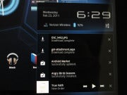
Of the models I looked at, notifications were best on Android 3.0 Honeycomb devices. The Honeycomb interface puts its notifications bar at the bottom right, where it unobtrusively informs you of new e-mail messages, new OS or software updates (for example, Pulse reader notifies you when new content is available), and completed downloads. New messages pop up there and then disappear. Tapping on the bar expands the notifications so that you can view them all. The same notifications bar shows time, connection status, and battery life; and you get more details plus one-tap access to settings when you tap to expand the bar.
Apple's iPad feels archaic by comparison. It provides notifications via a pop-up window that interrupts and disrupts your other activities. If you don't touch your device and you receive multiple notifications at once, iOS will collect them into a single window for you to view when you return. But if you get one for AIM (for example), dismiss it, and then get another one for AIM, it will pop up over whatever your current activity is each time, requiring you to take action in order to return to your activity. On the other hand, you get no notifications of new e-mail messages: To get those you must go to your e-mail app.
The Galaxy Tab runs Android 2.2, which delivers notifications in the "classic" Android style--a pull-down bar at the top of the screen--but they're far less elegant and usable than the notifications in Android 3.0.
Which Tablet Is Best for Multimedia?
The answer depends, in part, on your shopping habits and on how you use your tablet. Android 3.0 on the Xoom is a terrific multimedia combination: HD movies look great in the widescreen aspect ratio, you get Flash support for online video, and Google's redesigned music player is very appealing. On the other hand, Android 3.0 lacks a dedicated video player, so your videos get meshed into the Image Gallery.
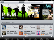
Apple's iPad requires iTunes syncing--a drawback considering the albatross that iTunes has become on the whole. But it's fairly good for organizing and keeping track of your media, and if the files are in a supported format, you can add your own videos to the iTunes library. If you have an iPod or iPhone, and you shop at iTunes, the iPad is a no-brainer for its seamless integration with the iTunes Store (shown here). At the moment, Google lacks anything comparable, though I can imagine Google deciding to sell music (Google Music is already a reoccurring rumor) and videos through its Market.
The Galaxy Tab uses Samsung's Media Hub to make music and video purchases, and to play them back. But Media Hub purchases are usable only with Samsung Media Hub devices, including Samsung mobile phones and televisions. Media Hub's selection is growing, but it's nowhere close to iTunes in depth.
Which Tablet Is Best for Organizing Your Stuff?
No currently available tablet makes managing your files easy. But the Xoom is the best bet right now. You don't get direct access to files and folders on the device, as you do in Microsoft Windows, but plenty of third-party apps will let you access files that are aboard the tablet (and when enabled, aboard the MicroSD card) in a standard folder view. You can download content from the Web browser, like a .zip file. And in the Google image gallery, you can view image info, crop it, and share it via Bluetooth. Meanwhile, organizing apps into home screens is simple, thanks to a split-screen approach that lets you select an app and drag it to your home screen of choice--all on the device.
Organizing apps on the iPad is tiresome, and you can forget accessing files stored on the device in order to reorganize, rename them, or do something with them. Apple has locked down the file system.
The Galaxy Tab lacks Android 3.0's niceties for organizing apps, but it does offer various options for sharing files. The Galaxy Tab also shows you image information, and it lets you crop an image. An accompanying app called My Files lets you view a file/folder directory of your content; but this simple app is incapable of renaming or moving files.
Which Tablet Is Best for Web Browsing?
The clear advantage in Web browsing goes to the Xoom. The Xoom's tabbed interface makes navigating through a multitude of Web pages remarkably easy. I also liked the visual bookmarks and appreciated the support for Adobe Flash Player 10.2.
The iPad 2 and the Galaxy Tab are both stuck in the dark ages of Web browsing. Both tablets permit you to access only one page at a time, so you must exit one page before you browse to another. In addition, both models limit the number of windows you can have open at a time.
Which Tablet Is Best for Gaming?
Apple's iPad 2 enjoys the clear advantage here. Today, Apple's iOS has a bigger selection and a bigger commitment from content makers than Android does, though more Android 3.0 games should become available as the year progresses. Millions of people use iPads already, and third-party benchmarks indicate that the new A5 chip has more graphics muscle than Nvidia's Tegra 2, which is found in the Xoom and in all announced Honeycomb tablets to date.
The Xoom has considerable potential for games, but first more Honeycomb-optimized apps must be developed first. Only then will it be possible to gauge how synthetic benchmark readings of the iPad's graphics capabilities stack up in the real world to its rivals'. As for the Galaxy Tab's prospects for gaming, let's just say that the future of Android gaming won't happen in Android 2.2 on a 7-inch tablet.
Which Tablet Is Best for Reading?
All of the major booksellers have apps available across mobile operating systems--except for Apple's iBooks, which (as you'd expect) is available only on iOS. All three offer flexibility in your choice of reading platform and shopping site; but in my opinion, none of these tablets is especially good for reading. I recommend instead the only tablet that isn't technically a tablet: Barnes & Noble's NookColor. Though NookColor runs Android 2.1, it lacks Google services and can't freely download or sideload apps. B&N remains the only company that has managed to combine very smooth text with an LCD screen that has very little glare.
Of the three true tablets, the Galaxy Tab has the edge because of its smaller size and sharper text quality. Apple's iPad 2 comes in second. Its larger screen makes it a good choice for viewing digital magazines or magazine apps, and it's good for viewing larger-print text. In addition, you have plenty of choice with regard to reading apps and bookstores, including Apple's iBooks and competitors such as Amazon and Barnes & Noble (that could change, however, once Apple begins enforcing its crackdown on in-app purchase options). Whichever model you choose, I recommend playing with the font choices in your chosen e-reader app, as some fonts render more smoothly than others.
Ditto for the Xoom: Font rendering could be an issue, as some text fonts look sharper than others. Today, the best reading app available for Xoom is Google Books, but its display options are limited (only three font sizes?) and using it entails committing to buying your books through Google's Market bookstore. Still, you do get a few font choices, and some of them render better than others. Honeycomb-optimized versions of Amazon's Kindle app and B&N's Nook app should arrive soon.
In Video: Apple iPad 2 vs. Motorola Xoom vs. Samsung Galaxy Tab
Planning to buy a tablet? Read our guide, "How to Buy a Tablet."
For the latest tablet news, join @pcwtablets on Twitter.
Wednesday, March 16, 2011
Which Tablet Works Best? Apple iPad 2 vs. Motorola Xoom vs. Samsung Galaxy Tab - PCWorld
via pcworld.com
Subscribe to:
Post Comments (Atom)


No comments:
Post a Comment